Brand Kit
Consulting + products, built in Tanzania.
The practical reference for the Ubunifu Technologies identity: the Ligature mark, lockups, palette, type, visual language, and writing voice.
Logo
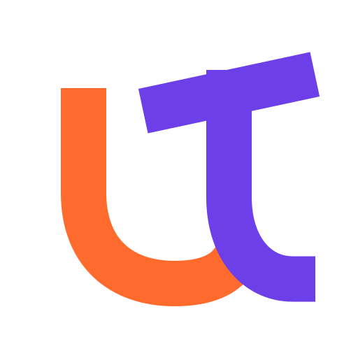
The Ligature — favicon, avatar, product signature
Primary lockup — everyday use
On dark backgrounds
The orange U and purple T interlock as one engineered glyph. The angled T crown introduces forward motion; the shared lower junction makes the initials inseparable. Keep the free-standing silhouette intact and always write the full company name in text-bearing lockups.






Signature path
#FF6B2C → #6D3FE8 — orange begins the path, purple resolves it. The gradient belongs in large headlines and atmospheres; the master mark uses two crisp solids.
Colours
Brand — Warm Orange
Brand Orange
#FF6B2C
rgb(255, 107, 44)
--brand
Logo, paths, large accents and atmospheres
Orange Hover
#E8581E
rgb(232, 88, 30)
--brand-hover
Decorative orange interaction states
Orange Deep
#C44615
rgb(196, 70, 21)
--brand-deep
Accessible orange for buttons and small text
Accent — Purple & Blue
Purple
#6D3FE8
rgb(109, 63, 232)
--primary
Ligature T, links, hovers and badges
Purple Hover
#5A2DD0
rgb(90, 45, 208)
--primary-hover
Purple interaction states
Purple Deep
#3D1FA0
rgb(61, 31, 160)
--primary-deep
Deep purple, pressed states
Blue
#2E5BFF
rgb(46, 91, 255)
--accent
Decorative only — soft background glows
Blue Hover
#1F47E0
rgb(31, 71, 224)
--accent-hover
Blue interaction states when blue is used
Foundation
Lavender (Background)
#F4F2FB
rgb(244, 242, 251)
--background
Page background
White (Surface)
#FFFFFF
rgb(255, 255, 255)
--surface
Cards, forms, navbar
Surface 2
#FAF8FE
rgb(250, 248, 254)
--surface-2
Alternate section background
Surface 3
#F0EDF9
rgb(240, 237, 249)
--surface-3
Subtle panels and dividers
Text
Navy (Text)
#1F1A36
rgb(31, 26, 54)
--text-primary
Headings & body copy
Secondary
#5A5170
rgb(90, 81, 112)
--text-secondary
Subheads, paragraph copy
Tertiary
#6B6385
rgb(107, 99, 133)
--text-tertiary
Labels, captions, helper text
Warm-earth accent
Clay
#C2693B
rgb(194, 105, 59)
--clay
Restrained editorial warm note
Typography
Aa
Poppins
Headings & logo — weights 600 / 700 / 800
Aa
Inter
Body & UI — weights 400 – 700
Aa
Monospace
Labels & kickers — UPPERCASE, wide tracking
Voice & rules
Voice
Confident, warm, specific — like a person who knows the subject. Not corporate. Avoid value-words (innovative, world-class, seamless).
Do
- Bright orange for the mark and large decorative accents.
- Deep orange (#C44615) behind white CTA text.
- Navy (#1F1A36) for headings & body.
- Purple sparingly — the Ligature T and a second accent.
- Generous white space; clean cards.
Don't
- Recolour, stretch, box in, or shadow the master mark.
- Bake the tagline into the logo lockup.
- Shorten the company name to “Ubunifu” in a text-bearing lockup.
- Use bright orange for small body text on light.